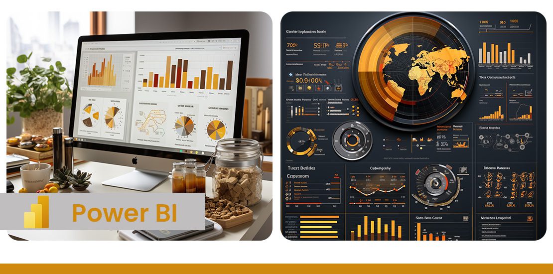
Power BI is a data visualization and business intelligence tool developed by Microsoft. It provides an interface for users to connect to the respective data sources and generate visually pleasing reports. Power BI custom visuals development provides provision to share and publish one’s work easily and securely. These reports can be viewed in browsers, tablets or mobile devices and does not require any installation for the same.
Overview of Power BI
Power BI helps to bridge the gap between data and decision making by providing a unified, scalable platform for self-service and enterprise business intelligence (BI). Power BI can be used to connect to and visualize any data, and also seamlessly infuse the visuals into the apps you use every day.
Power BI offers the following services:
- Power BI Desktop – Windows based application for designing and publishing reports
- Power BI Service – SaaS based online Power BI service
- Power BI Mobile Apps – Mobile apps for Android and IOS phones
- Power BI Gateway – Gateway to sync external data in and out of Power BI
- Power BI Embedded – APIs to build dashboard and reports to custom applications
- Power BI Reporting Server – On-prem Power BI reporting solution
- Power BI Visuals Marketplace – Marketplace of custom visuals
Power BI Desktop
Power BI Desktop is a free application you install on your local computer that lets you connect to, transform, and visualize your data. With Power BI Desktop, you can connect to multiple different sources of data, and combine them (often called modeling) into a data model. This data model lets you build visuals, and collections of visuals you can share as reports, with other people inside your organization. Most users who work on business intelligence projects use Power BI Desktop to create reports, and then use the Power BI service to share their reports with others.
There are three views available in Power BI Desktop, which you select on the left side of the canvas. The views, shown in the order they appear, are as follows:
- Report: You create reports and visuals, where most of your creation time is spent.
- Data: You see the tables, measures, and other data used in the data model associated with your report and transform the data for best use in the report’s model.
- Model: You see and manage the relationships among tables in your data model.
Power BI desktop allows you to do ETL tasks. It provides provision to connect to access data from hundreds of supported on-premises and cloud-based sources, such as Dynamics 365, Salesforce, Azure SQL DB, Excel, and SharePoint. Power BI also ensures the data is always up to date with automated, incremental refreshes.
In Power BI Desktop, you can clean and transform data using the built-in Power Query Editor. With Power Query Editor, you make changes to your data, such as changing a data type, removing columns, or combining data from multiple sources. For that, you start with a large block of data, then remove or add data points or features as needed, until the data is how you want it. After you have a data model, you can drag fields onto the report canvas to create visuals.
A visual is a graphic representation of the data in your model. There are many different types of visuals to choose from in Power BI Desktop. A collection of visuals, in one Power BI Desktop file, is called a report. A report can have one or more pages, just like an Excel file can have multiple worksheets. Power BI Desktop enables you to create complex and visually rich reports, using data from multiple sources, all in one report that you can share with others in your organization.
Features in Power BI
-
Filters
Power BI provides an option to add filters to visualization. Filters help the user to narrow down the charts such that they can quickly find the data they want. It helps the user to refine their analysis and thus gain deeper insights into their data. Filters can be applied against a chart, a page in the report or even against the entire report.
-
Buttons
Buttons are another feature provided by Power BI. With buttons in Power BI, you can create reports that behave similarly to apps, and create an environment where users can hover, click, and further interact with Power BI content. Some of the buttons supported by Power BI include Back button, Bookmark button, Drill-through buttons, Page navigation, Q&A and Web URL buttons. Buttons help make the reports more interactive.
-
Drill down
Power BI provides support for the drill down method. To use this method, Power BI visual should have a hierarchy. The main value of drilling down on data is the fact that it lets you interactively dig through hierarchical information without the need to create an extra report or overcrowd your current report with dozens of charts. If the selected visual supports hierarchy, on drilling down the same chart gets updated with the hierarchy data. Since it avoids the need for creating a new chart, the report looks less complex. Drill down can be done one field at a time or all fields all at once.
-
Drill through
A drill through is an analytical feature that allows you to visualize additional, more detailed information about a specific KPI in a report. While drilling down provides granular information within a specific chart or data set, drill throughs display another aspect of the data that might be relevant, and it does it by opening a pop-up chart. Although, in some cases, if the data is too big to be displayed using a pop-up, the drill through can also take you to a different dashboard just by clicking on the specific point you want to expand on.
-
Integration with R and Python
Power BI introduced a new feature where users can run python and R code within Power BI. For doing so, the respective software, Python or R must be installed in the system. After that, python or R codes can be executed from Power BI and the resultant results can be imported as data source in Power BI. For data that requires complex data transformation and cleaning, the process can be carried out using python libraries such as Pandas and the resultant data frames can be imported into Power BI as an input data source.
-
Custom visualizations
Power BI custom visuals development has a lot of in-built charts that can be used for most of the real-world applications. On top of this, Power BI also supports custom visualizations. Such visuals can be created by anyone and host it in a marketplace where it is accessible to other users. To create custom charts, Power BI provides visuals SDK to create stunning data visualizations based on well-known JavaScript libraries such as D3, jQuery, and even R-language scripts.
Uses cases of Power BI Custom Visuals Development
TA has experience doing several projects in Power BI. TA has leveraged all of the above-mentioned Power BI features in these projects. Different data sources were used in these projects ranging from SQL server tables, PostgreSQL tables, Excel and CSV files, external APIs, python code etc. Data was imported from these different data sources to create data models and establish connections among the different models. Once the cleaning process is done, charts are created using the imported data. Most of the visualization includes bar charts, percentage charts, pie charts, donut charts, tree maps etc. In some projects, custom charts such as gauge charts were also used. These custom charts downloaded from the Power BI marketplace were also used among other charts in Power BI reports.
Features such as buttons were also added to the dashboard so that the user can navigate among different reports in the dashboard. The button can be customized by adding colors, text, changing the enable/disable behavior etc. Having such features provides them a feel of using a web application which users are more accustomed to. More complex features like drill down and drill through were used to explore more on the source data. Access based restriction was also added based on the project requirement. This is done by adding user roles so as to restrict data depending on user roles. This feature helps to share the power bi reports with different audiences without giving them access to the entire data. They can also view and play around with whatever is made available to them.
One of the projects on ship inspection analysis can be seen here. Here drill down was used on tree map visualizations involving ship masters. Number of observations against each ship master is displayed using the tree chart. Chief engineer is also another important role and to view the same data for chief engineer, the chart can be drilled down. Similarly, a drill-through feature is also used in the same project. In the first report page, the basic details of the ships are provided. If the user wants to explore or view more details about each ship, he can select the ship of his interest and then select the respective button to activate the drill through function. This takes him to a new report page with charts specific to the ship he has selected. DAX functions were also used within the same project to perform calculations with the source data.
TA has done several projects related to Power BI custom visuals development and leveraged most of the important features within Power BI to meet the business requirements. These features start right from loading data, cleaning and transforming data to generating reports and finally publishing or sharing it with the stakeholders with access restrictions.